


 NEW Belhaven Best fonts are to be rolled out across Scotland as part of a major facelift for the popular ale.
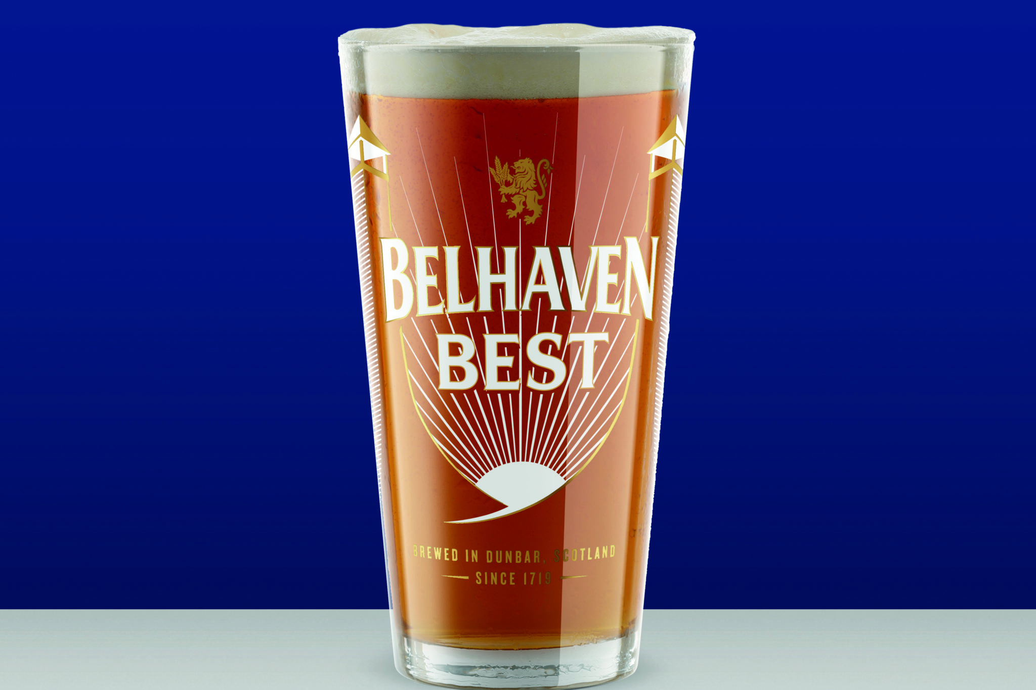
The new-look fonts will be introduced from this month, sporting a new colour scheme and a design which aims to reinforce the history of brewing at Belhaven’s Dunbar brewery, featuring its iconic malting chimneys framed by rays of sunshine.
“Belhaven’s success over the past 300 years is built on creating exceptional quality beers, but also on our ability to respond to the changing tastes of modern drinkers,” said Belhaven brand manager Fiona Matheson.
“Best is as popular as ever and is currently gaining in market share, but we felt that it deserved better when it came to its presentation. We also wanted to challenge the old-fashioned image of ale and communicate its freshness.
“This has been a labour of love that the Belhaven team has worked on for many months and we are thrilled with the results! The new design looks stunning, premium and appealing, perfectly balancing Best’s past and our ambition for the future, whilst reflecting the wonderful qualities of the ale inside.”
But while the look has changed, every pint of this easy-to-drink 3.2% ABV ale continues to be brewed in Scotland by Belhaven’s master brewers to ensure quality and sessionability.
The rollout of the new look will begin mid-May with venues receiving new fonts, tap handles and keg lenses. There will also be a comprehensive POS kit featuring striking, branded glassware plus T-shirts, bar runners, drip mats, posters and table talkers.
The rebrand will be backed by a launch campaign across all media types across 2023, celebrating Best’s past, present and future.