New-look aims to increase visibility
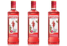
BEEFEATER 24 has been given a makeover with a new red glass bottle designed to increase visibility of the gin on the back-bar.

The new bottle for the London Dry gin features the same embossed design, which was inspired by the Arts & Crafts movement of the 20th century, on the glass along with a refreshed Beefeater 24 label.
Parent company Pernod Ricard said the new-look bottle, which replaces its clear glass predecessor, is designed to mirror the 12 botanicals in the 45% ABV gin, which was created especially for bartenders and is described as having a complex flavour profile.
Adam Boita, head of marketing at Pernod Ricard UK, said the new bottle design is intended to reinforce the differences between Beefeater 24 and Beefeater Dry, and help attract new consumers to the super-premium gin category.
“The striking red bottle is a symbolic colour for Beefeater and we believe the new look will enhance stand-out on the back-bar and appeal to gin lovers and Beefeater fans alike,” said Boita.
“We have made a significant investment into the updated Beefeater 24 redesign as we believe it will increase product visibility and, as a result, attract new consumers to the category who are looking to experiment with super-premium gin.”


