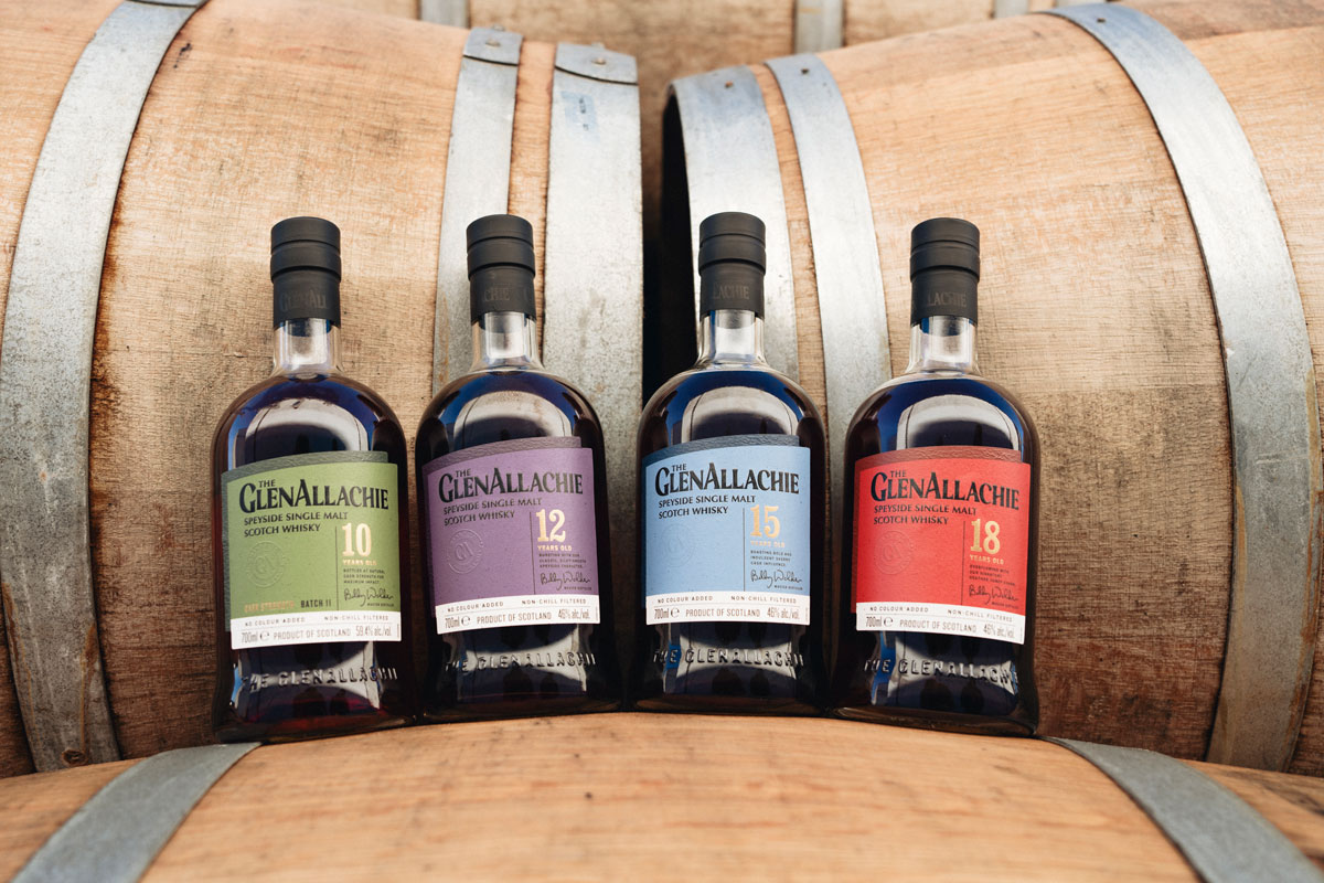
 Independent Speyside-based Scotch whisky distillery The GlenAllachie has ‘rejuvenated’ the look of its single malt brand, with a new logo and packaging.
Spearheaded by legendary whisky maker of 52 years, Billy Walker, The GlenAllachie has quickly won renown for its spirit quality and cask innovation. The revamped visual identity, developed by Scottish design agency Threebrand, is said to ‘represent the brand’s evolution’ since the first-ever core range was brought to market in 2018.
The labelling’s slanted design elements are said to be inspired by both the unique shape of the distillery’s gable end and the brand’s upward trajectory. More prosaically, The GlenAllachie has worked with only UK-based packaging suppliers to reduce its carbon footprint.
Brand messaging has also been renewed, underpinned by the tagline ‘whisky in good hands’, which champions the expert team behind The GlenAllachie. However, the distillery stressed that its award-winning whisky will remain unchanged, with the core offering continuing to include the 10, 12, 15 and 18-year-old bottlings.
But in order to streamline the portfolio, the various limited edition series will now all fall under one umbrella range, The Wood Collection, with the first additions due to be unveiled next month.
Commenting on the announcement, marketing director Colette Savage said: “The updated look sets out to modernise, premiumise and refine the brand, bringing the packaging in line with the quality inside the bottle. With an acceleration in demand for The GlenAllachie worldwide, the transformation was necessary to elevate brand credibility and strengthen its visual appeal on a global scale.“
A key stipulation of the project was to ensure we performed a rejuvenation rather than an overhaul. Indeed, the iconic bottle and core range colours are integral to The GlenAllachie’s brand identity and have been retained. The visual progression will aid in shaping the future of the brand as a heavy hitter in the Speyside single malt space.”

Managing Director at Threebrand, Gary Fortune-Smith added: “This was a carefully considered rebrand journey. The GlenAllachie has a fiercely loyal consumer base, who are not to be lost in the process, whilst the brand strives to reach new ‘whisky explorers’ by better visually reflecting the superb quality of their liquids.
“We aimed to strengthen the brand story; the positivity and progress of the ‘angle’ reflects their continual strive for excellence and is also a direct nod back to the brand home. We worked closely with the GlenAllachie team to gain real insights and understanding, which has led to an outcome we’re all very proud of.”